 Français
 Español
 Português
 Italiano
 Français
 English
What size of image for which block?
Changing image size and ratio:
When you want to add or modify an image on your site, the dimension of your image will not necessarily be adapted to the dimensions of the “block” you are modifying.
Example:
A “square” image in a “rectangular” block.
You’ll need to resize the image to fit the chosen frame.
- There are several ways of doing this:
Reminder: ratio (ratio between image height and width).
- Only one ratio available:
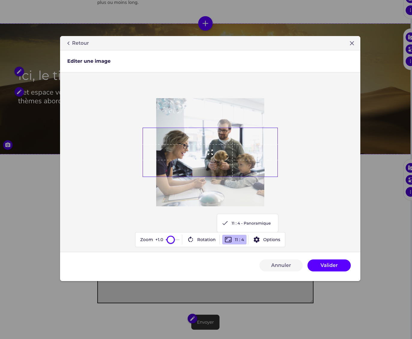
Some blocks like this one are built with only one format available.
You must therefore use the ratio imposed by this block.
You can use the editable area of the image to increase or decrease the size of your ratio, using the slider below your image
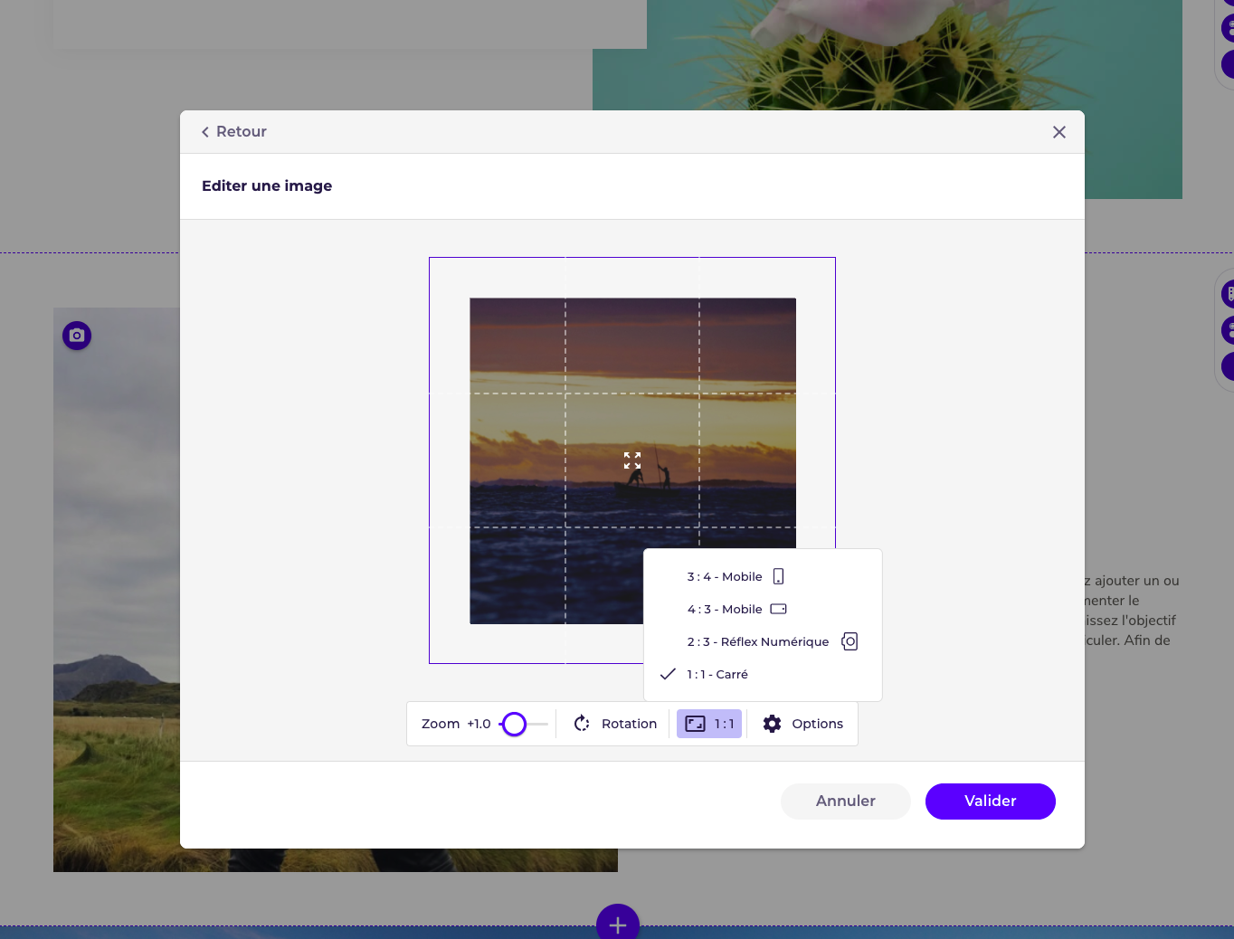
- Several ratios available:
- Category example: “Text and image
(A ratio optimized for editing an image and text in horizontal alignment).
In this case, the chosen block allows you to choose from different image formats.
Simply select the ratio icon of your choice to choose the layout that suits you best.
You can also use the image’s editable area to enlarge or reduce the size of your ratio using the slider below your image.
– Depending on the different block categories at your disposal we’ve adapted different ratio choices to optimize your content block.
- Specific ratios :
We call these ratios “specific” because they don’t correspond to a “standard” size, but to ratios we’ve chosen in order to personalize the rendering of our image galleries as much as possible.
- Tablet and Smartphone:
When it comes to the behavior and appearance of your blocks, and in particular your images, on Smartphones and Tablets, we’ve built and adapted our solutions to adapt intelligently to your different media (Responsive Design).